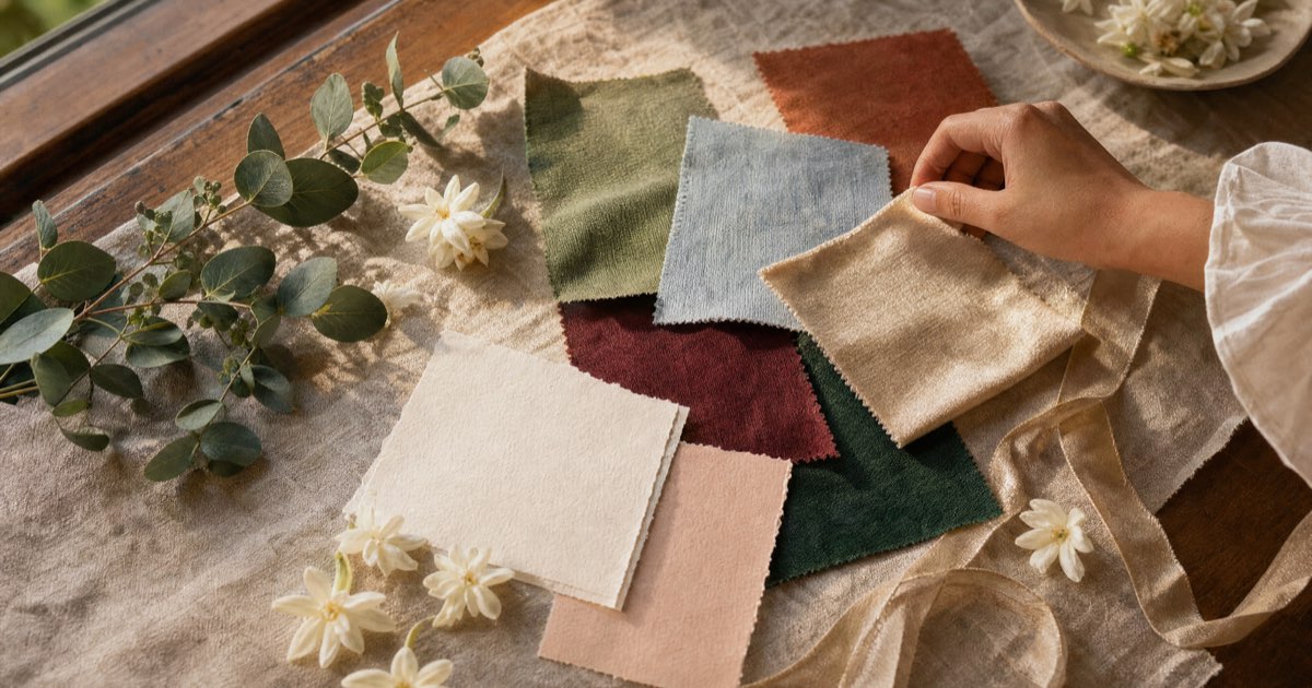
Wedding color palette ideas for Filipino weddings: 14 palettes with hex codes
Fourteen wedding color palettes for Filipino weddings, each with hex codes, the season and venue it suits, and a text color that stays readable on invitations.
A wedding color palette is three to five colors that everything in your wedding follows, written as hex codes so the florist, dressmaker and stationer match the same shades. Choose by venue, then season, then how the colors sit against your entourage's skin. The 14 palettes below each come with codes and a readable text color.
See a finished palette on a live invitation: the Piña sample is banana-leaf green with gold.
If you're still deciding on the overall look (flowers, styling, how formal), start with our wedding motif guide. This page picks up once you know the mood and need exact colors.
How to read the tables
Each palette has four roles. The base covers most of the space: tablecloths, invitation paper, walls of the backdrop. The main color is what people remember, usually the bridesmaids and the flowers. The accent shows up in small amounts, like ribbon, cutlery and foil. The ink is the dark shade you print words in.
Pale motif colors look lovely on fabric and are hard to read as text. Gold #C9A86A on ivory has a contrast ratio of about 2:1, and dusty blue #8FA6B8 on ivory about 2.4:1. The WCAG contrast minimum for body text is 4.5:1. Every ink in these tables clears 6.8:1 against its own base, so your lola can read the invitation on her phone.
The last column names the closest color preset on a Ceremo invitation template, taken from the template's own code. Where the preset is also the template's default look, it's marked "default".
Daytime and garden wedding color palettes
These suit the dry season. PAGASA splits the Philippine year into a dry season from December to May (cool from December to February, hot from March to May) and a rainy season from June to November. Morning and late-afternoon light in the dry months flatters soft colors that ballroom lighting would flatten.
| Palette | Base | Main | Accent | Ink | Closest preset |
|---|---|---|---|---|---|
| 1. Sampaguita | #F6F1E7 | #3F5A3C | #C9A86A | #2C3424 | Piña (default) |
| 2. Sage and gold | #F6F1E7 | #9CAF88 | #C9A86A | #3F5A3C | Heirloom "Olive & Linen" |
| 3. Terracotta and sand | #EDE0CF | #B85C38 | #6B7F5E | #3C2415 | Terracotta (default) |
| 4. Old rose | #F0E4E0 | #A86161 | #8B7F6E | #4A2C2C | Terracotta "Dusty Rose" |
| 5. Beige and olive | #F0EBE4 | #6B6F4A | #CDC5B8 | #4A3B32 | Terracotta "Warm Linen" |
| 6. Champagne and blush | #FBF6F1 | #EADBC8 | #E7C4BC | #3E2E26 | Regal "Champagne Blush" |
1. Sampaguita
Sampaguita whites with the dark green of its leaves and a little gold. The flower has been the national flower since Proclamation No. 652 of 1934, and its colors are the most forgiving set on this page. An all-white entourage with green accents works in a cathedral or a garden. Sampaguita garlands for the principal sponsors make it literal. The Piña template's default look is the dark version: banana-leaf green, cream and gold.
2. Sage and gold
The gold warms sage up under yellow church lights. Our sage green wedding motif guide has five sage palettes and the entourage attire to go with them.
3. Terracotta and sand
The palette of clay roof tiles in late-afternoon sun. It suits heritage houses, Tagaytay gardens and sunset ceremonies. Dried grasses and flowers suit it well.
4. Old rose
A muted pink with brown in it, softer than blush and less sugary. Keep the ninangs in the deeper #A86161 and the bridesmaids in something paler so the rows read clearly in photos.
5. Beige and olive
Quiet and cheap to source, because beige and olive fabric is everywhere. The risk is that beige close to skin color disappears in photos, so give the entourage the olive and keep beige for linens and paper.
6. Champagne and blush
The warm neutral most couples mean when they say "classic". Pair it with one stronger color in the flowers or it can look like every other wedding your guests attended this year. The base, main and accent codes match the Champagne and blush palette in our champagne wedding motif guide. The ink is the Regal preset's #3E2E26, darker than that guide's rose-brown detail color, so small print stays easy to read.
Evening and ballroom wedding color palettes
Deep colors earn their place indoors and at night. They also suit the rainy months: PAGASA's tropical cyclone data says an average of 20 cyclones enter the Philippine area each year, and July to October is the peak. Most couples marrying then book a covered venue anyway, and dark hems hide the walk from the car.
| Palette | Base | Main | Accent | Ink | Closest preset |
|---|---|---|---|---|---|
| 7. Dusty blue and gold | #FAF7F1 | #8FA6B8 | #C9A86A | #26344F | Regency "Powder" (default) |
| 8. Emerald and gold | #F6F3EA | #2E6B4F | #836925 | #1F3A2E | Regal "Emerald & Gold" |
| 9. Burgundy and gold | #F8F2EC | #7A2A35 | #876721 | #4A1C24 | Regal "Burgundy & Gold" |
| 10. Navy and piña gold | #F2E9D8 | #26344F | #D9BE85 | #26344F | Piña "Dagat" |
| 11. Lavender and ink | #FAF7F1 | #D9CFE6 | #6E5A9C | #26344F | Regency "Wisteria" |
| 12. Black and white | #FFFFFF | #1C1C1C | #E5E5E5 | #1C1C1C | Minimal "Museum White" |
7. Dusty blue and gold
Dusty blue reads formal almost by itself, and gold keeps it from turning cold. It also works for a cool-season garden wedding. Our dusty blue wedding motif guide covers the five blues people mix up and which blue flowers you can actually source.
8. Emerald and gold
The most formal palette here. It belongs in a church with dark wood or a hotel ballroom, and it's hard to pull off at a noon beach ceremony. The hex values come from the Regal template's preset. Our emerald green wedding motif guide has attire by entourage role.
9. Burgundy and gold
A December favorite. With #7A2A35 as the main color, keep everything else ivory, or the room gets heavy fast. The Maison template's "Oxblood" preset (#6E1F24 on warm paper) is a more modern take. Our burgundy wedding motif guide has four more burgundy pairings.
10. Navy and piña gold
Navy with a pale gold that looks like the sheen on piña cloth. It's a natural fit for a barong and Filipiniana dress code. The navy is the same #26344F used in our navy blue wedding motif guide. On the Piña template, the "Dagat" preset puts the same gold hairlines on a slightly deeper navy page (#1F2F45).
11. Lavender and ink
On its own, lavender can look sweet. Deep navy ink for the words gives it weight. Ask your florist which purple blooms they can get in your wedding month before you commit, since flower supply shifts through the year.
12. Black and white
Popular for civil weddings and restaurant receptions. With only two colors, texture does the work: heavy paper, linen napkins, one kind of flower in quantity.
Beach and fiesta wedding color palettes
| Palette | Base | Main | Accent | Ink | Closest preset |
|---|---|---|---|---|---|
| 13. Seafoam and driftwood | #E4E8EA | #4A7C8A | #B89070 | #2A3640 | Terracotta "Ocean Driftwood" |
| 14. Fiesta | #FFFFFF | #C2185B | #F2A900 | #2B2B2B | None; set colors section by section |
13. Seafoam and driftwood
Blue-green water and bleached wood, for Batangas, La Union or Palawan. The venue does most of the decorating, so keep fabrics light and let the sea be the main color in the wide shots.
14. Fiesta
Fuchsia and marigold, with leaf green #4C8C2B and sky blue #7FB8E0 as optional extras, borrowed from banderitas strung over a town plaza. It stays elegant if you limit where the color goes: bright in flowers, favors and the dessert table, white everywhere else. Marigold #F2A900 on white is about 2:1, so never print words in it.
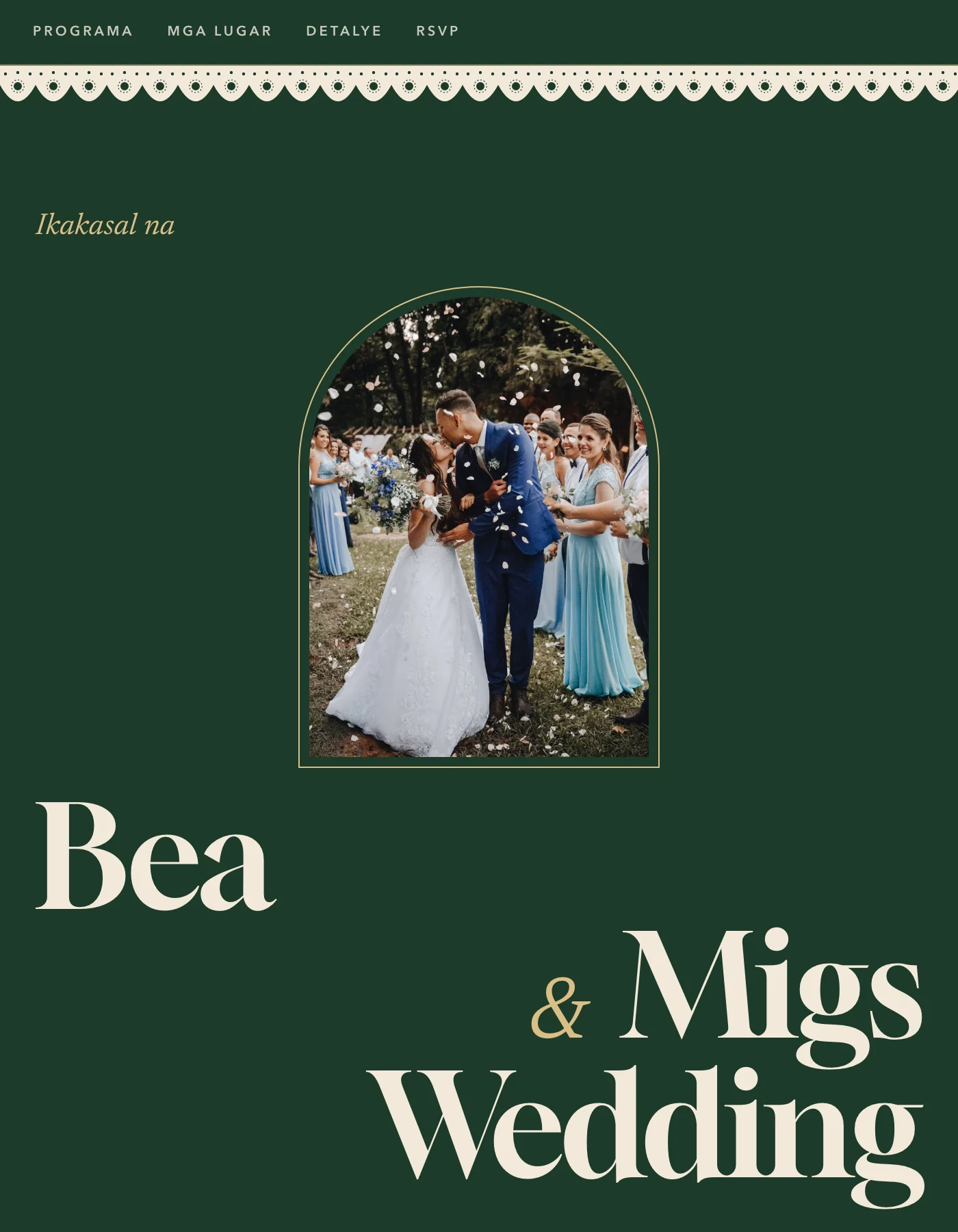
The Piña sample invitation shows a dark palette done well: cream words on #1E3B2B green, with #D9BE85 gold kept for small details.
How do you choose a wedding color palette?
Work through these in order. Each step should knock a few palettes off your list.
- Start with the venue. Look at what won't change: the wood of the pews, the carpet in the ballroom, the color of the garden at the hour you'll marry. Your palette has to live next to it in every wide photo. A church with dark wood and gold retablos already has half of palettes 8 and 9 built in.
- Check the month. Dry-season daytime weddings suit the first table. Rainy-season and evening weddings suit the second. December has its own pull toward burgundy, emerald and gold, which means your guests will have seen those at every Christmas party that month.
- Test against the entourage's skin. A Filipino entourage covers a wide range of skin tones, and the principal sponsors are often a generation older. Hold the fabric under several faces in daylight and take a phone photo. Colors close to skin tone (beige, nude, pale champagne) tend to blend in. Medium and deep shades hold up next to almost everyone. When in doubt, give the entourage the main color and keep the pale base for linens.
- Check the gown. An ivory gown with champagne beading pulls the whole palette warm. A bright white gown looks gray next to cream linens, so match the base to the gown.
- Decide the ink. Pick the dark color for printed and on-screen words now, while you pick the rest. It saves a reprint later.
Keep proportions roughly 60/30/10: base, main, accent. When a palette looks off in photos, the usual cause is too much of the main color, so add base before you swap shades. Our motif guide explains the split.
How do you share the palette with suppliers and guests?
Send hex codes instead of color names. "Sage" means a different green to every supplier. Put the codes, a printed swatch and the proportions in one file, and send the same file to the florist, stylist, dressmaker, cake maker and the lights operator.
Then print it and hold it up at the venue, at the time of day you'll marry. The same swatch can look like three different colors on your laptop, on your phone and under fluorescent light.
Guests need less detail than suppliers. Show the palette on the invitation with a line such as "We'd love to see you in earth tones" and let them work with that. Our entourage list guide covers who wears what by role, and the invitation card design guide covers printing motif colors on paper.
Put the palette on your invitation
Your invitation is the first place guests meet your colors, so start there. On a Ceremo invitation, the guest details section can show your palette as up to 12 named swatches, next to an attire guide with colors and photos for up to six roles. Both are free, and so is setting colors section by section in the design studio.
The one-click color presets named in the tables are Premium, a one-time ₱2,499 per invitation. The template defaults marked "default" (Regency's powder blue, Terracotta's clay and the Piña green) cost nothing. If you only need a printed card, a stationer or a free Canva template is enough. Ceremo is worth it when you also want every household's RSVP in one list.
The free plan covers up to 50 guests. Start your invitation and try your palette on a template, or compare plans on the pricing page.
Frequently asked questions
What is a wedding color palette?
A wedding color palette is the short list of colors, usually three to five, that every part of the wedding follows: invitations, entourage attire, flowers, linens and signage. Writing each color as a hex code lets the stationer, florist and dressmaker match the same shade.
How many colors should a wedding color palette have?
Three to five. Use one light neutral for most of the space, one main color, one accent, and a dark shade for printed words. More than five gets hard for suppliers to match and hard for guests to follow in a dress code.
What wedding colors suit the rainy season in the Philippines?
PAGASA puts the rainy season from June to November, so most receptions move indoors. Deeper palettes such as emerald and gold, burgundy and gold, or navy and gold hold up under ballroom lighting and hide the odd splash of mud on a hem better than pastels.
What is the difference between a wedding motif and a wedding color palette?
In Filipino usage, the motif is the overall look of the wedding, including its colors, flowers and style. The color palette is the exact set of colors inside that motif, written down as hex codes so every supplier matches the same shades.
Which wedding colors look best on Filipino skin in photos?
There is no single answer, because skin tones in one entourage vary a lot. Medium and deep colors such as emerald, burgundy, navy and terracotta usually hold up next to most skin tones. Very pale beige or champagne close to skin color can blend in, so test fabric under the faces in daylight.